RailRunner needed a full identity upgrade.
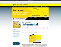
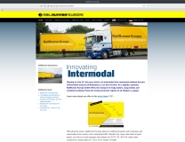
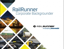
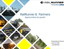
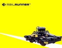
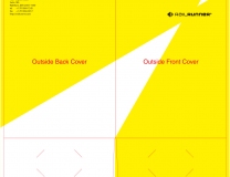
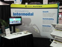
Their Intermodal Rail System allows trains to be assembled directly from specially-built trailers and easily moved from the road to the rail. A new logo representing the intersection of road and rail networks helped simplify their story. The company’s black and yellow color palette was retained but widened for greater visual interest, and some secondary typefaces were chosen to help carry a new look across website, brochures and business cards, advertising, trade show booth design, etc.
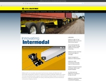
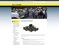
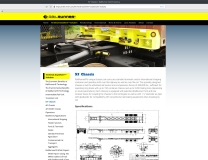
I hand-coded the first version of their website in PHP, and later recreated the design with a WordPress child theme and duplicated the site’s functionality with plugins, in order to accommodate the need of foreign subsidiaries to maintain their own versions of the site.
